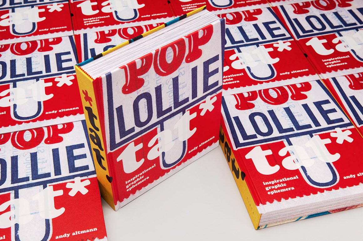
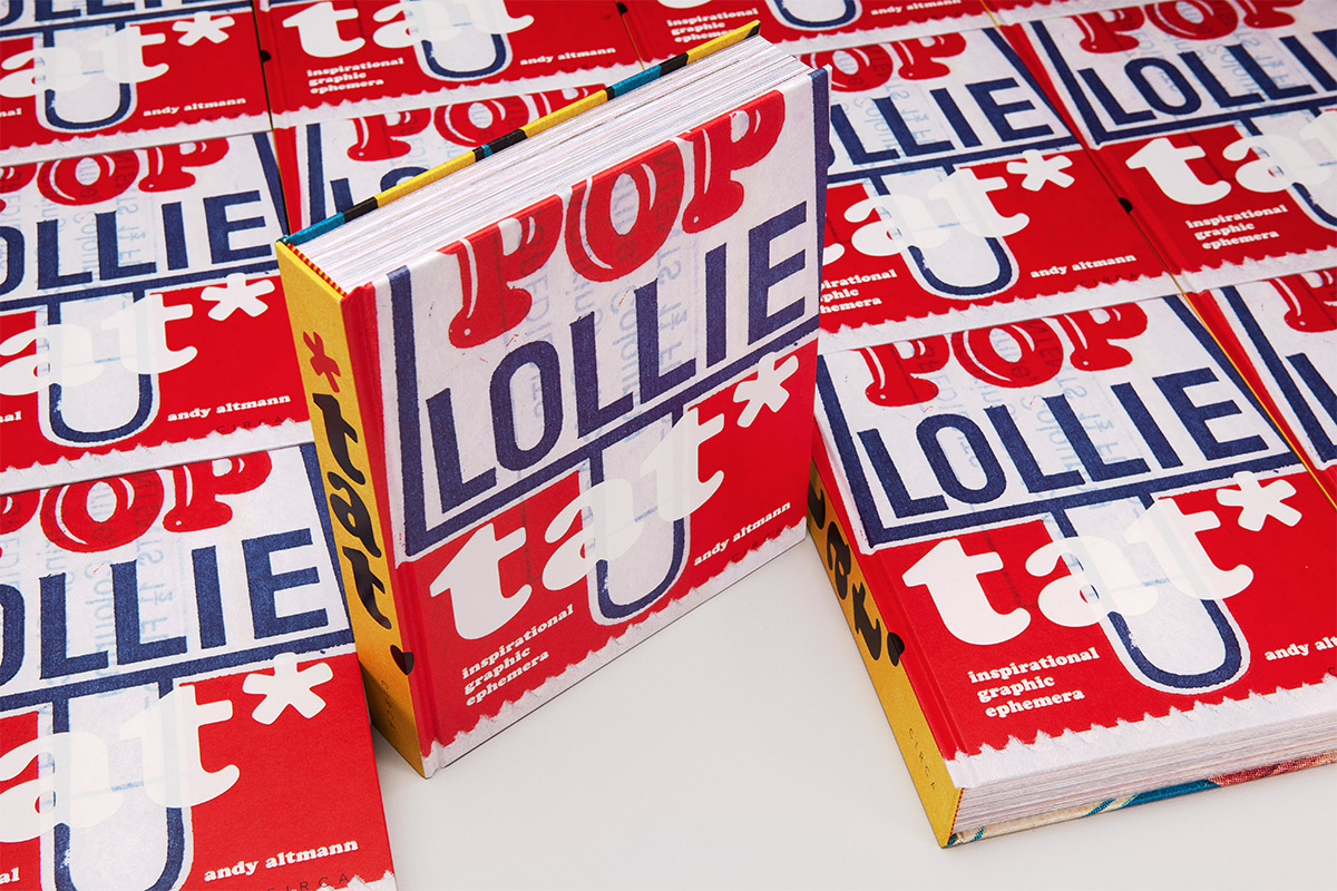
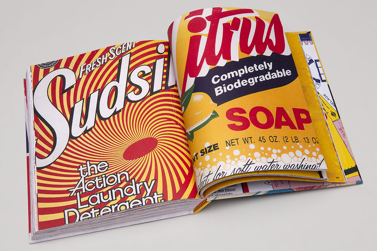
tat* by Andy Altmann
Some people collect wine or classic cars; others collect coins or stamps. Andy Altmann collects graphic ephemera – or what he calls ‘tat’. Altmann developed his interest in scraps during his career at Why Not Associates, the multidisciplinary studio he founded upon graduating from the Royal College of Art over three decades ago. Now, the graphic designer has compiled his collection in a singular, self-designed publication. Here, Altmann speaks to LUX about how the book mirrors his design evolution, and why brash design need not be devoid of beauty
 1. Of all the things you might collect, you chose ‘tat’. Why?
It’s hard for me to explain exactly why I collect tat*. When I was a young boy, my mother noticed me sitting at the kitchen table, carefully studying the label on an HP Sauce bottle. When she enquired why, I apparently replied, ‘someone must have to design this’. I was instinctively attracted by the lettering, the colours and the illustration of the Houses of Parliament on what is still my favourite condiment. It’s a classic example of what was once known as ‘commercial art’. It did its job and pulled me in.
Follow LUX on Instagram: luxthemagazine
However, I didn’t start collecting any graphic ephemera until I was studying graphic design at St Martins School of Art in the early 1980’s. We were encouraged to keep sketchbooks, where we could practice our drawing and put our creative thoughts down on paper. I wasn’t as gifted as some of my peers at drawing, so I started to turn these sketchbooks into idea notebooks where I would also stick in any relevant piece of graphic ephemera. With time, these developed into pure scrapbooks with more and more tat* lovingly glued into their pages. There is a great nostalgic attraction to the particular era that the ephemera has been produced in. But it is also my fundamental fascination with popular culture, including the history of Pop Art, which was and still is a huge influence on me – where the everyday is embraced and celebrated.
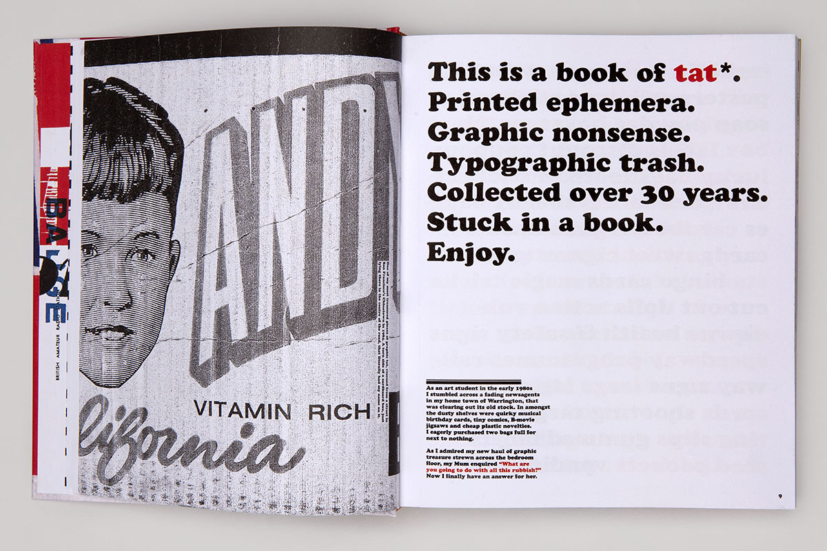
2. tat* emphasises the disposability of graphic ephemera even while immortalising it in book form. What fascinates you about that interplay?
These ephemeral pieces of tat* were not designed to survive for a long time. They had a job to do and, in the majority of cases, they end up in the bin. There is certainly irony in me celebrating what some may see as poor graphic design, destined for the trash, ending up in a fancy hardback coffee table book. But I hope people can also see the beauty in the ugly. The cheap production values of much tat* means that the printing is often poor and mis-registered – but to me, this only adds to their aesthetic attraction. I don’t know why this should be: maybe it’s like a stamp collector who is looking for a printing mistake, which makes a stamp much rarer. I think it may however be that they just feel more human, less perfect.
tat* by Andy Altmann
3. You frequently extrapolate memories from the graphic scraps reproduced in tat* – of your upbringing in Warrington, or sitting and watching World of Sport with your grandfather. Could we call it a diary of sorts?
I guess it is a kind of diary, as it illustrates moments through my life in association with printed pieces of ephemera. They can evoke various memories of where I may have found them, who gave it to me or a subject that is dear to me. A good friend of mine, on reading a copy of the book, described it as now being his ‘favourite autobiography’. I really like that description. It was a revelation to me, as I had not thought of it in that context, but it’s a really interesting way of viewing it.
As a graphic designer, it is rare for me to be asked to write about anything. I consider myself more of a visual person, so I was hesitant to include any written words in the book. But I was encouraged by friends to have a go at including relevant stories after recounting some of them when showing them work-in-progress spreads. In the end, I found the writing a really enjoyable and rewarding experience, and it turned the final book into a much more interesting piece of work.
Read more: Pioneering Artist Michael Craig Martin on Colour & Style
4. Much of that depicted in tat* is brash, erroneous, or what might be considered ‘bad’ graphic design. What value is there to be derived from this kind of design?
Having a collection of graphic ephemera can be useful to any practicing graphic designer. It’s a library of visual thoughts. Some may be deemed naff or crude but any piece could spark an idea, illustrate a great colour palette, inspire a typographic layout or choice of font. It doesn’t really matter that it may be considered ‘bad design’ – there may well be something that could be taken to start a tract of creative thought.
I was a co-founder of the multidisciplinary design practice Why Not Associates. I used to keep all my scrapbooks of tat* in the cupboard next to my desk. If a designer was having a creative block I used to encourage them to flick through some of the scrapbook pages in the hope that they may spark an idea or just freshen the mind. Some of our best ideas started from a thought inspired by a piece of tat*.
tat* by Andy Altmann
5. tat* is clearly fascinated with vintage or retro design. Would you say that any one period inspires you most as an artist and, if so, which one?
That period would be the 1960’s and 1970’s because, as with many people, I think I am most strongly drawn to the period of my childhood. It is where we form our fundamental characteristics and loves that stay with us for life. I guess it’s the basic human desire for nostalgia for our youth. One only has to watch contemporary television to see the many shows dedicated to salvaging objects from peoples childhoods or early adulthood.
Read more: Big Boy Blue: In the Studio with Idris Khan
6. You ran a design studio, Why Not Associates, for 33 years before you decided to embark on more personal projects like tat*. How have you ensured that your designs stay inventive and surprising throughout your career?
I co-founded Why Not Associates with two fellow students on leaving the Royal College of Art in 1987. We never worked for another design company, and I think because of this direct transition we maintained the spirit for experimentation and surprise that we had developed as students. We left the RCA with just three drawing boards, but we were among the first design groups to buy an Apple Mac. We were not scared of the change, unlike many of our contemporaries, and we embraced the technology which led us to be one of the first multidisciplinary design groups. An open mind to change, collaborating with people of all ages and not taking yourself too seriously help to keep new, inventive and surprising ideas flowing.
I don’t think my approach to solving a creative problem has basically changed over the years. I am a curious person who loves researching the background to a project and this always forms the platform to relevant and strong ideas. However, you still need that child-like mind to embrace the unexpected. Look at it upside down and back to front. What at first may seem to be a daft notion or irrelevant idea could turn it into a thought provoking concept.
Find out more: circa.press


Recent Comments